bon appétit
Information Architecture Redesign
Contributor
Emilia Paris
Project Timeline
April–May 2025

Website Overview
Bon Appétit (www.bonappetit.com) is a food-focused website featuring professionally tested recipes, product reviews and shopping guides, culinary travel, and food commentary with cultural insight. As the digital extension of Bon Appétit magazine, it serves both casual home cooks and passionate food enthusiasts.
Project Objective
Our goal was to redesign the Bon Appétit website’s information architecture to better support user needs and business goals, focusing on helping users efficiently find content and complete key tasks. The existing structure made it difficult to locate relevant information and did not align with user expectations or business objectives.
Our Process
We completed this project in five stages:
- 01 Discover Needs
- 02 Evaluate & Analyze
- 03 Synthesize: From Analysis to Sitemap
- 04 Refine, Validate, & Design: From Sitemap to Navigation
- 05 Design: From Navigation to Wireframes
01 Discover Needs
USER NEEDS & BUSINESS GOALS
We began by defining the business goals of the Bon Appétit website and identifying 25 common user tasks. We then highlighted the tasks that aligned with key business priorities.
Bon Appétit Business Goals
- Acquire new customers
- Boost sales
- Build brand authority
- Diversify revenue streams
- Increase customer loyalty
- Promote diversity, equity, & inclusion
Top Tasks Aligned with Business Priorities
- Book culinary travel
- Buy merchandise
- Buy recommended products
- Create & manage account
- Download the Epicurious App
- Explore expert-curated restaurant reviews
- Find recipes by preparation method, meal type, or specific ingredients
- Sign up for “Cook with Bon Appétit” box
- Sign up for newsletter
- Start free trial (subscription to Bon Appétit & Epicurious)
PERSONAS
Based on our research, we created two user personas to better understand user needs and to keep the focus on our users throughout the project.


02 Evaluate & Analyze
GAP ANALYSIS
We conducted a gap analysis on the 25 common tasks we identified to find missed opportunities and areas needing improvement.

Key Issues Identified During Gap Analysis
- Users cannot purchase products directly from Shopping pages—they are redirected through articles with external links, leading to lost revenue opportunities.
- Although “Culinary Getaways” is a top-level link, the Travel page is hard to find and lacks clear calls-to-action, resulting in missed conversions.
- Recipe categories are confusing and require too much navigation. Clear labels, interactive filters, and better visual hierarchy are needed to improve user experience and discovery.
TREE TESTING ON EXISTING INFORMATION ARCHITECTURE
We then performed online tree testing with 6 participants using 10 priority tasks and the existing information architecture.
Tree Testing Analysis
- Out of all tasks completed by participants, only 63% ended up at the target destination, and only 73% of the destinations were chosen without backtracking.
- Participants struggled to find the information they needed, and challenges were spread across multiple tasks.
Key User Pain Points Identified
- Unclear labels: “The BA Box” menu link uses an unfamiliar abbreviation that may be unclear to users.
- Redundant labels: Having closely related labels, such as “Recipes” and “Ingredients,” at the same navigation level creates uncertainty about their distinct purposes.
- Too many navigation links: Excessive links at each level can overwhelm users and make it difficult to find key information
03 Synthesize: From Analysis to Sitemap
OPEN CARD SORTING
To explore users’ mental models, we conducted online and in-person open card sorting with 10 participants using the 25 identified tasks.
Key Insights from Card Sorting
- Participants favored clear, simple labels and broader category groupings.
- Uncommon tasks and vague task descriptions weakened group and label alignment.
- Participants used more creative labels when uncertain about groupings.
- Some participants felt increasingly overwhelmed as uncategorized tasks accumulated, causing decision fatigue.
ABSTRACT INFORMATION ARCHITECTURE
Based on our card sorting analysis, we developed an abstract information architecture.

FIRST VERSION OF SITEMAP
We then created the first version of our sitemap.

04 Refine, Validate, & Design: From Sitemap to Navigation
LABEL SCORING
We reviewed and updated the labels obtained from our card sorting analysis using five key criteria: well-known, easy, real, brief, and representative. Our goal was to make the labels more intuitive and easier to understand, improving navigation and overall user experience.

UPDATED ABSTRACT INFORMATION ARCHITECTURE
We then updated our abstract information architecture with the new labels and a “recipes” subcategory.

TREE TESTING OF NEW ABSTRACT INFORMATION ARCHITECTURE
We conducted online tree testing with 4 participants using the same 10 tasks and our new information architecture.
Tree Testing Analysis & Comparison to Previous Testing
- Out of all tasks completed by participants, 80% ended up at the target destination, a 17% increase from previous testing.
- 68% of the destinations were chosen without backtracking, a 5% decrease from previous testing.
- With the new information architecture, participants more often found what they were looking for, though the navigation path remained somewhat unclear.
- Lack of context and unclear task wording may have contributed to ongoing issues with specific tasks, such as subscribing to the “Cook with Bon Appétit” box.
- Labels like Recommendations could be clearer and and more accurately reflect the content.
TWO NAVIGATION OPTIONS
Using our new abstract information architecture, we created 2 navigation options.
Navigation Option 1

PROS
- Improved discoverability: All major sections are immediately visible to users.
- Faster access: Users can access content with fewer clicks and less effort
CONS
- Cognitive overload: Too many options can overwhelm users, leading to indecision and missed content.
- Fragmented experience: Related categories (e.g., Shopping and Recommendations) may be split across separate menu items.
Navigation Option 2

PROS
- Reduced top-level cognitive load: The primary navigation offers fewer choices, is easy to scan, and minimizes decision fatigue.
Scalable for large sites: It supports expandable subcategories without cluttering the main navigation.
CONS
- Hard to make labels representative enough: It’s challenging to choose labels that clearly reflect the full scope of subcategories.
- More clicks to reach content: This can slow down access to key pages if not carefully structured.
05 Design: From Navigation to Wireframes
LOW & HIGH FIDELITY WIREFRAMES
We created low fidelity wireframes and one high fidelity wireframe using one of our navigation options.
Home screen (low-fi)
Subscription Plans (low-fi)


Recipes by Meal Type (low-fi)
Home screen (hi-fi)


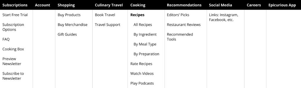
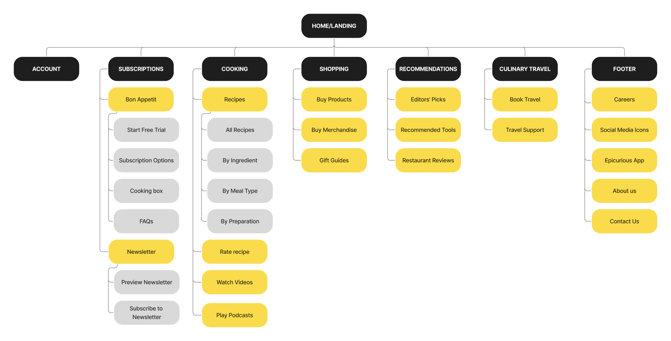
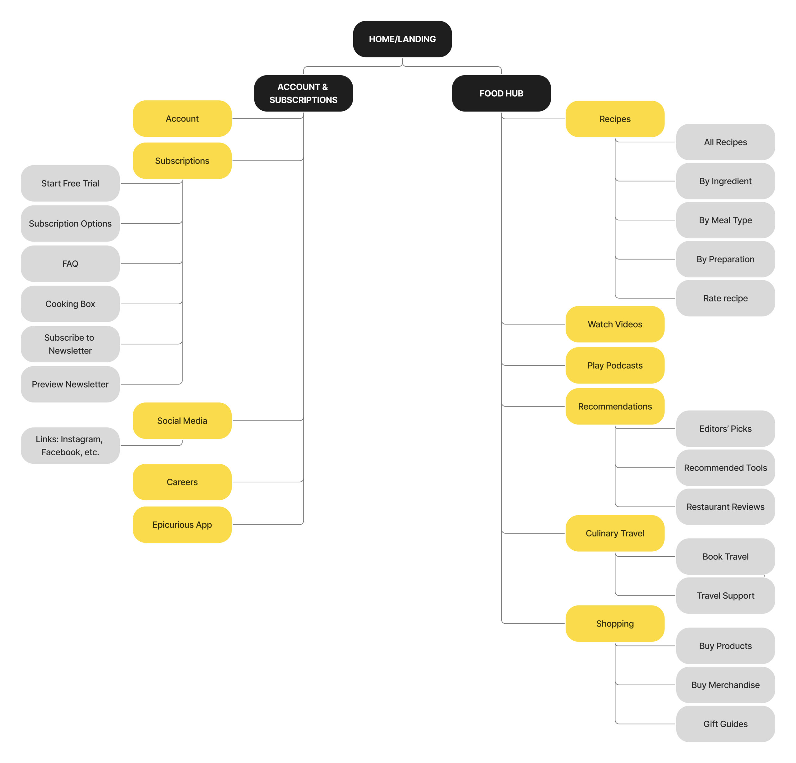
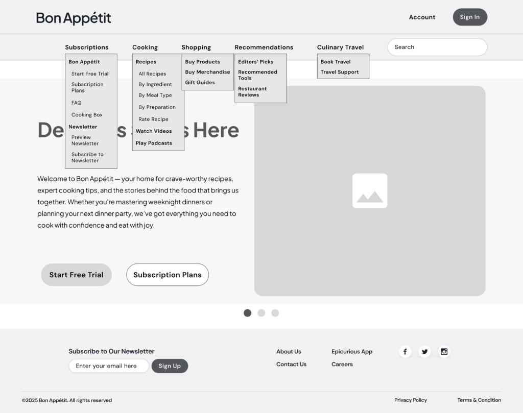
Potential Impact & Next Steps
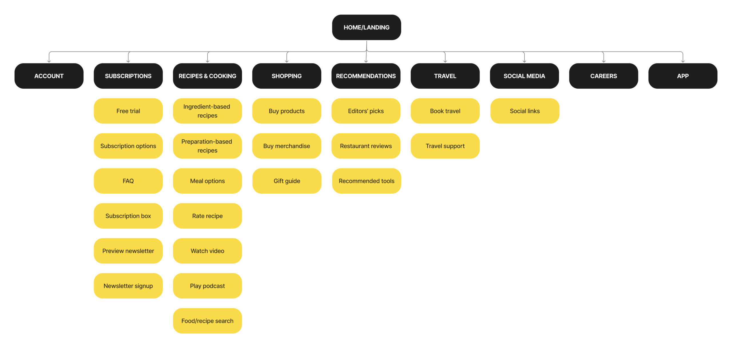
Our proposed design aligns with both business objectives and user needs by:
- Enabling users to efficiently complete key business-aligned tasks
- Simplifying navigation through clear labeling and a streamlined structure
- Enhancing discoverability while minimizing cognitive load
This approach is designed to drive measurable outcomes, including increased sales, stronger customer loyalty, and increased brand authority.
The next steps involve further iteration and refinement of the design to enhance the clarity of the navigation path, supported by continued user testing. Once an effective solution is identified, we will proceed with development and implementation of the necessary changes.