Jimmy Choo Nail Colour
Realistic Art | Adobe Illustrator, Photoshop, & InDesign
Design Brief
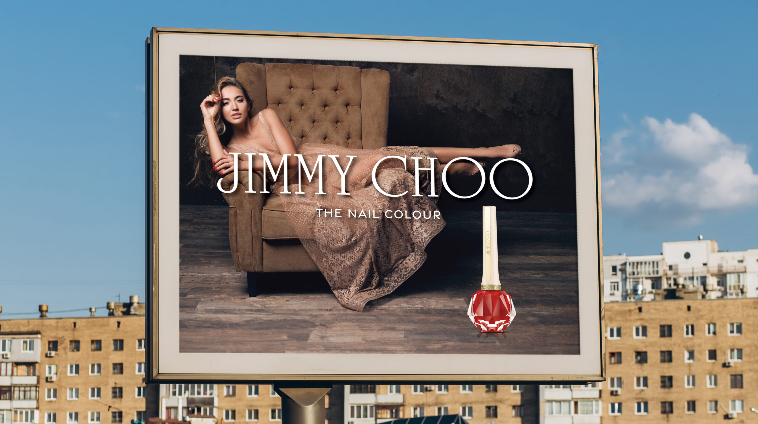
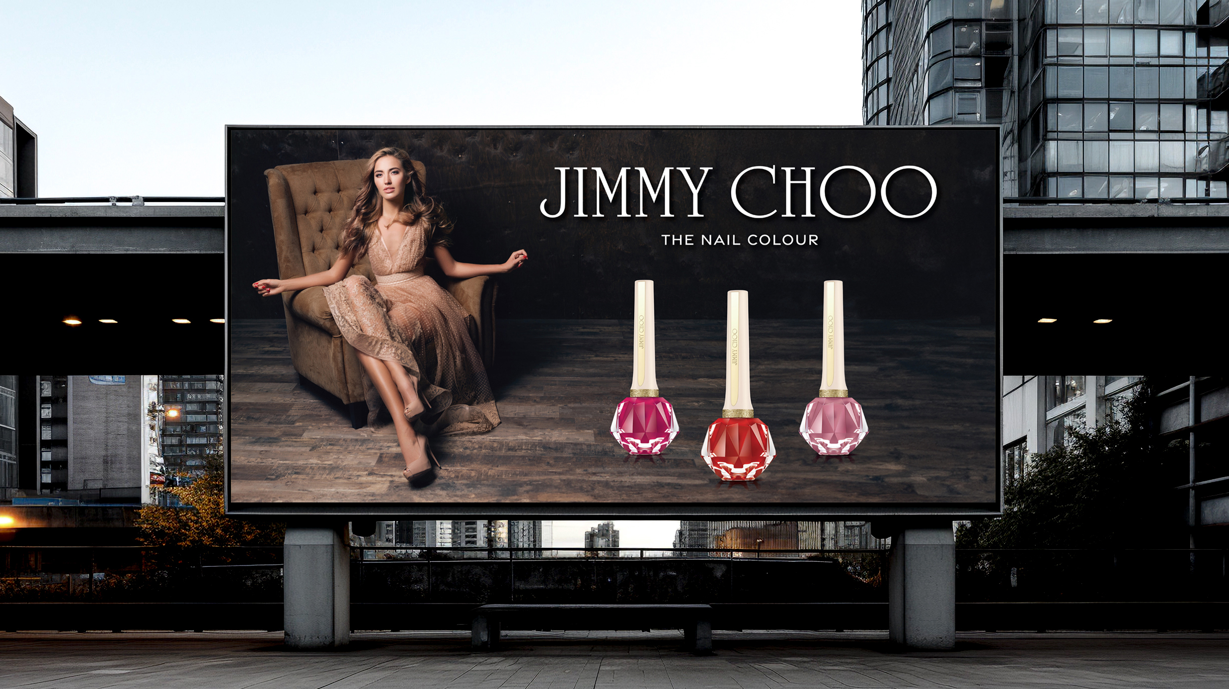
The challenge was to use Adobe Illustrator to create a photo realistic illustration of a product. The scope of this project also included creating an advertising campaign for the product featuring the photo realistic illustration.
Design Solution
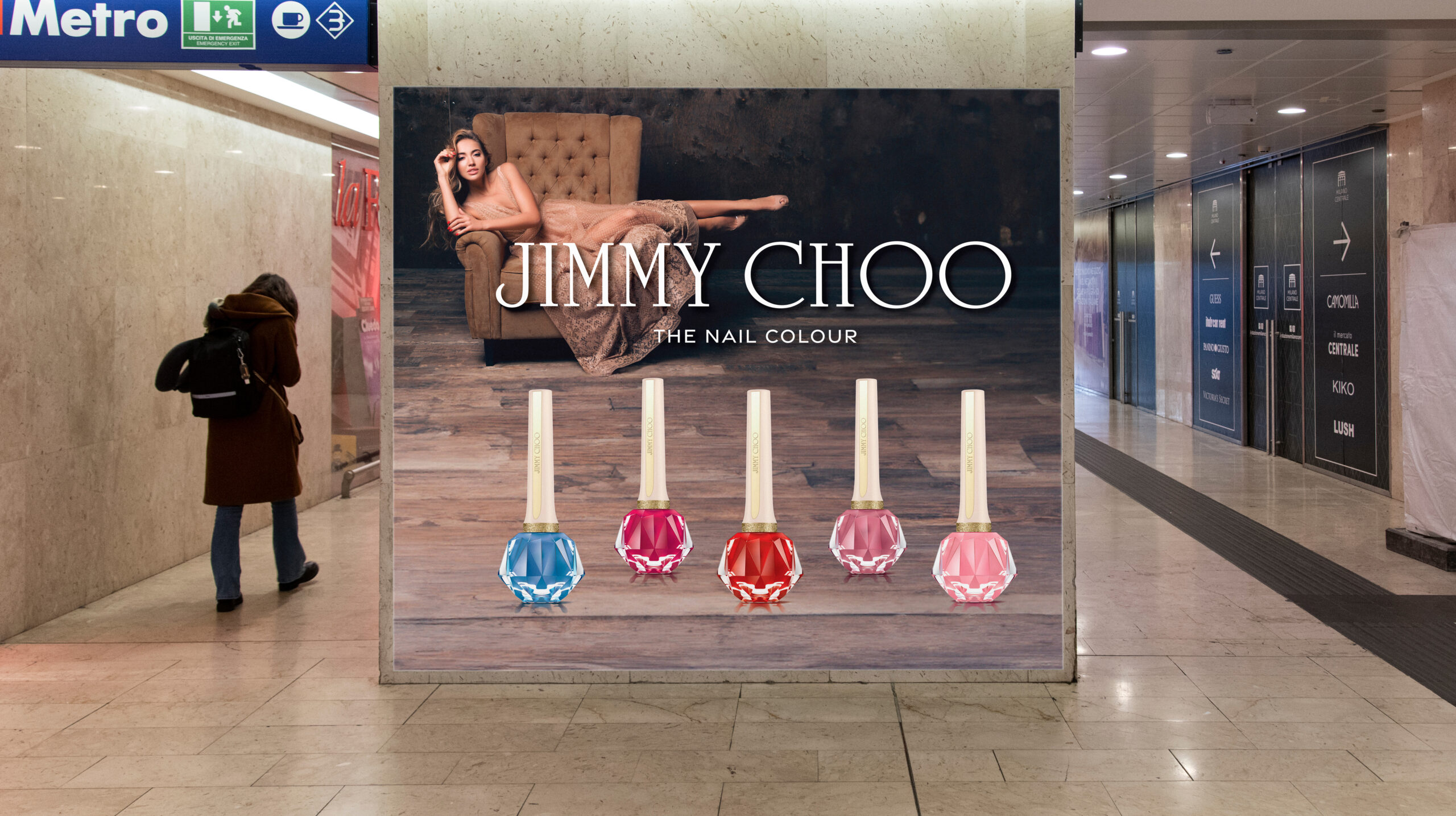
I chose to create a photo realistic illustration of Jimmy Choo’s nail colour in radiant coral because I was attracted to the elegant bottle’s intricate design. After finishing my original realistic illustration, I designed an ad campaign for print and digital, created four color variations of my realistic illustration, and then expanded my ad campaign to include the product line. My objective was to create illustrations that looked like photographs and a corresponding ad campaign that aligned with the Jimmy Choo brand, especially with regards to imagery, typography, and layout.
Design Process
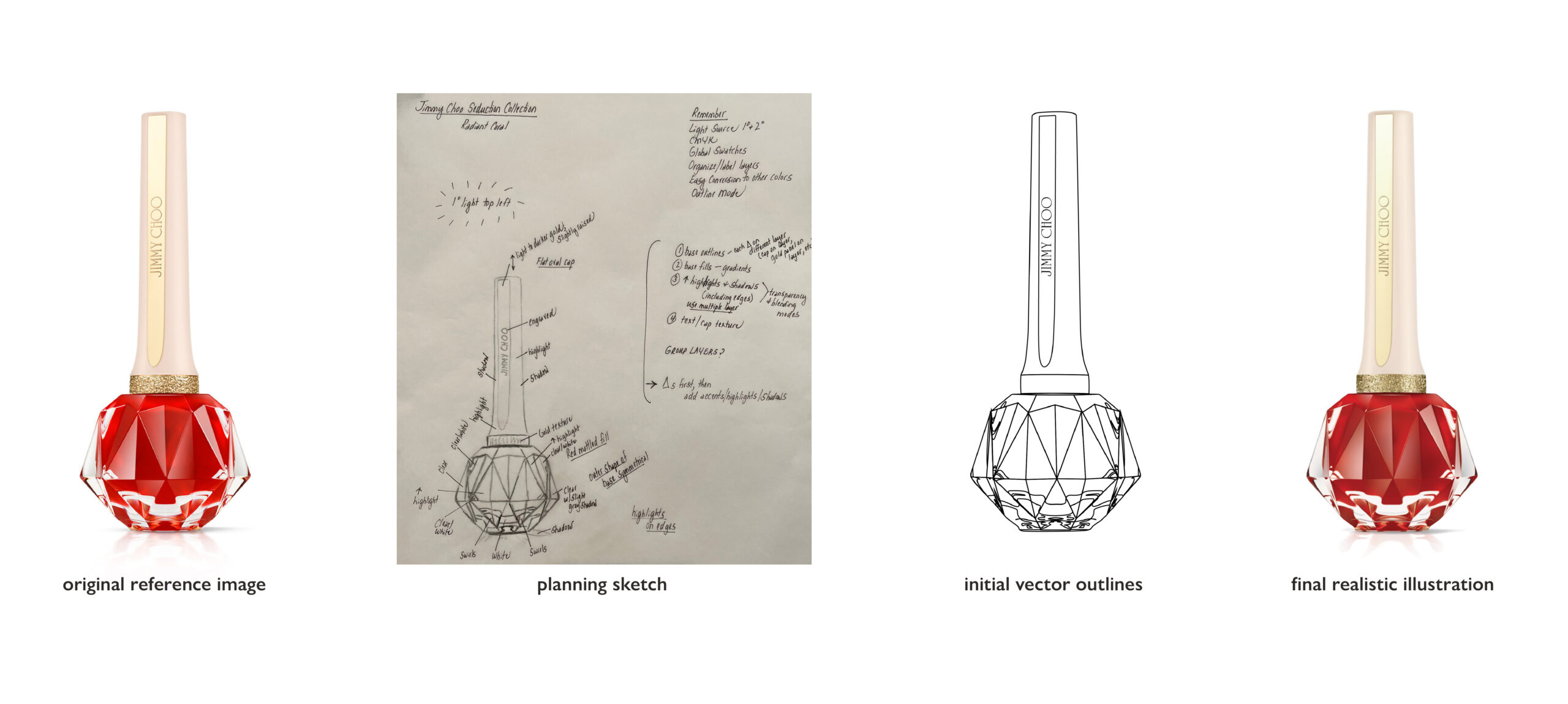
After choosing my product, I found a high-resolution, well-lit reference photograph and created a detailed sketch and design plan. Then I brought my sketch and reference photograph into Adobe Illustrator and completed the photo realistic illustration in a series of careful steps and many named layers, starting with vector outlines and base colors and ending with details, such as shadows, highlights, glitter texture, and typography. I relied on many Illustrator tools to create the illustration, including the pen tool, gradients, gradient mesh, transparency and blending modes, global swatches, eye dropper tool, and symbol sprayer tool.
Drag the slider and see the transformation!
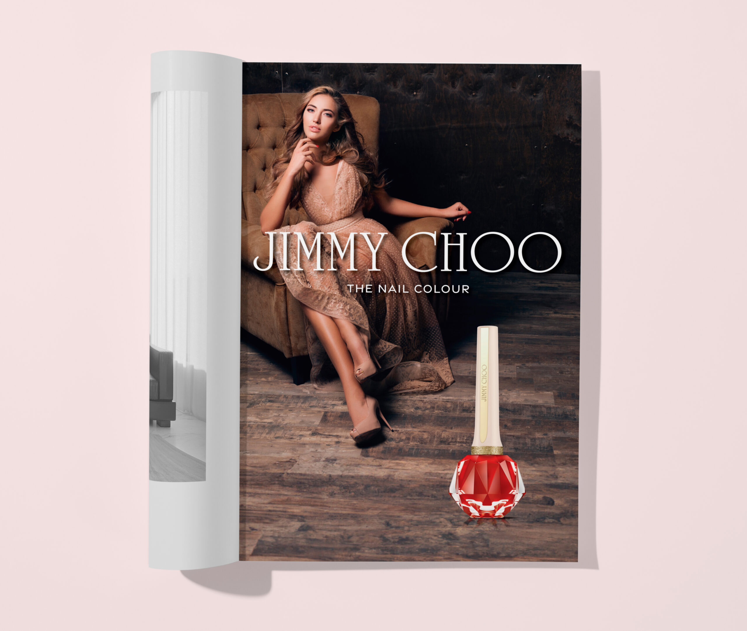
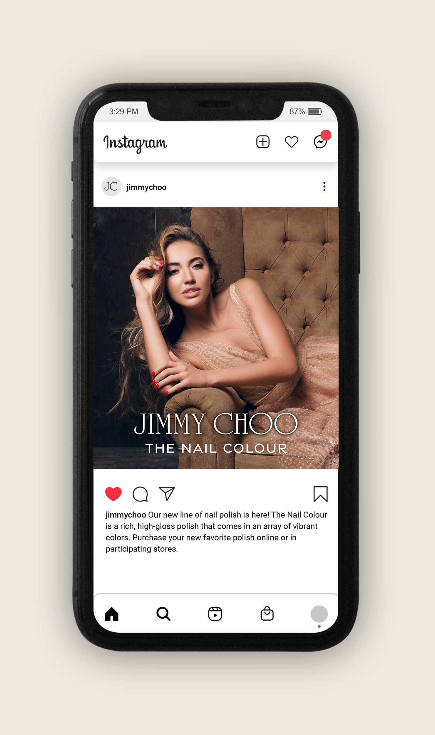
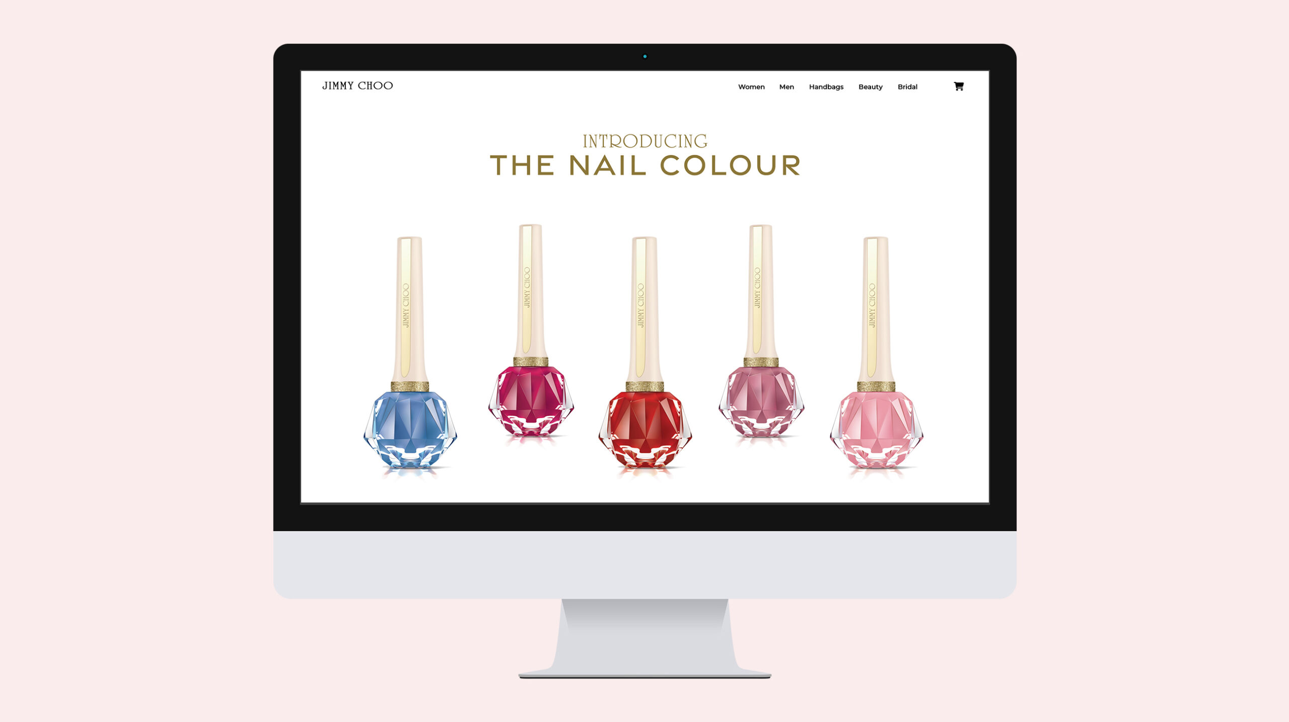
After creating the original realistic illustration and related advertisements, I created four color variations. Global swatches and organized layers were the key to recoloring my original illustration in Adobe Illustrator. I then expanded my ad campaign to include the entire nail colour product line and also designed a Jimmy Choo desktop splash page, shopping page, second Instagram post, and product packaging.
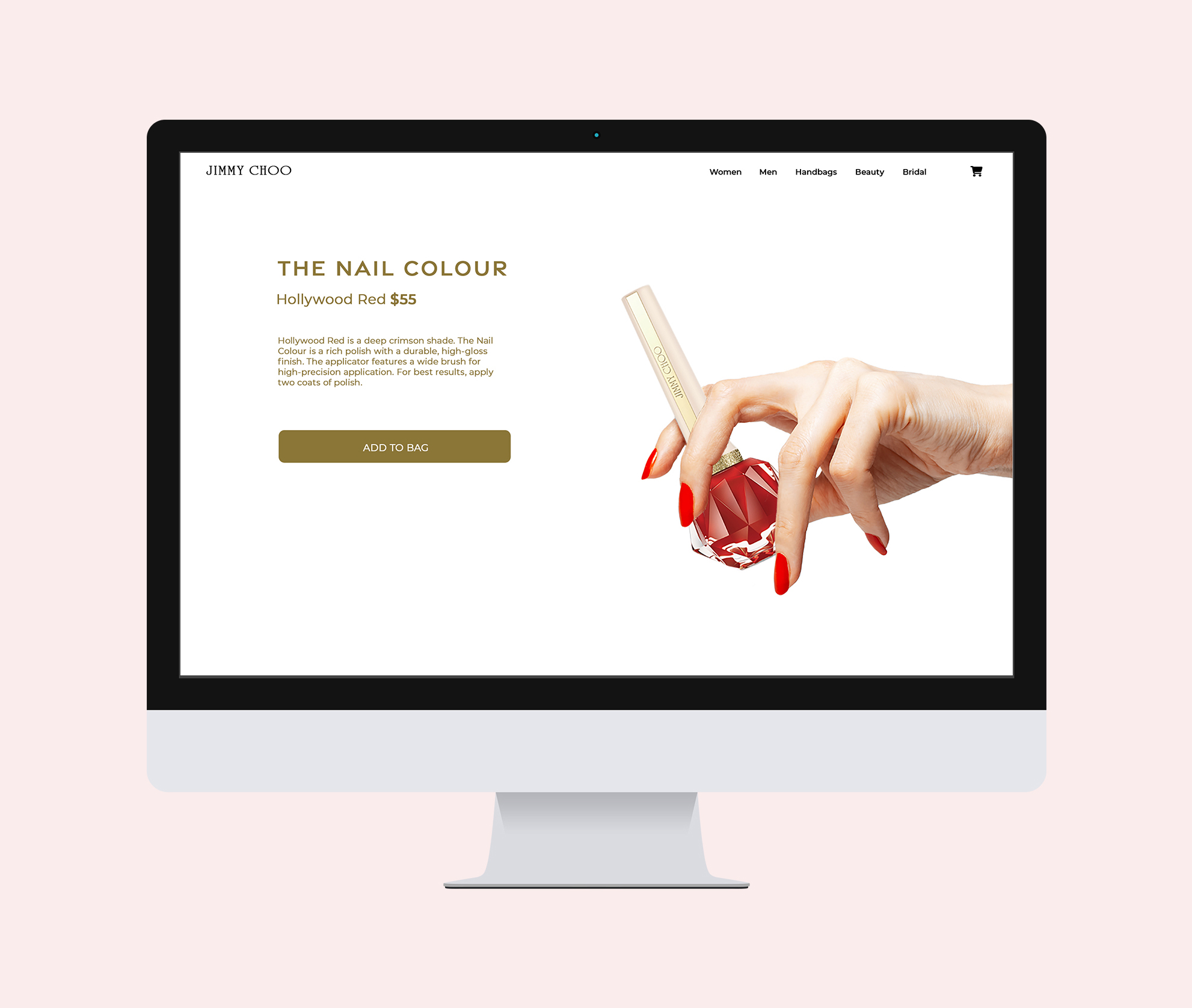
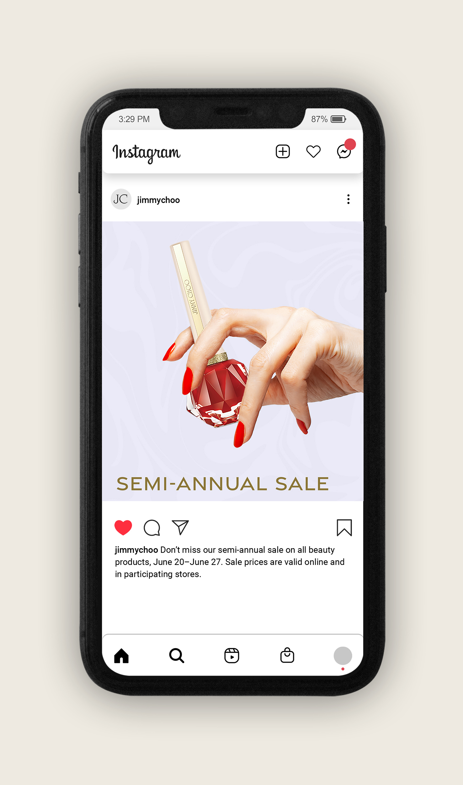
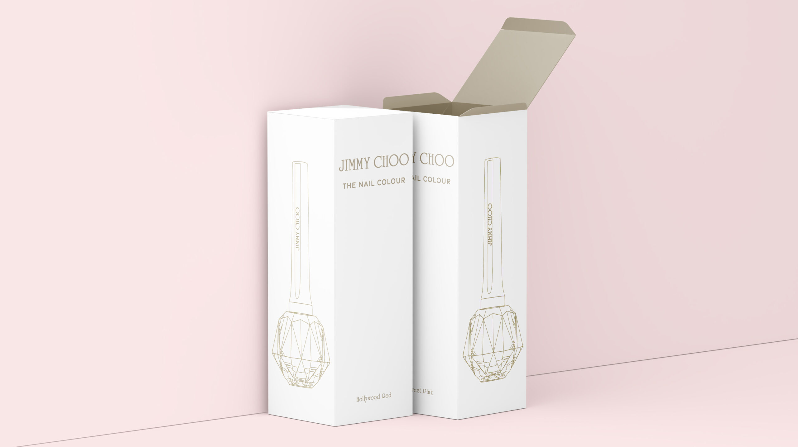
For the Jimmy Choo shopping page and Instagram ad, I used Adobe Photoshop to create a composite of a hand holding my original realistic illustration. The product packaging features the gold vector outlines of my realistic illustration on a white background. I then added text in gold that aligned with my ad campaign.
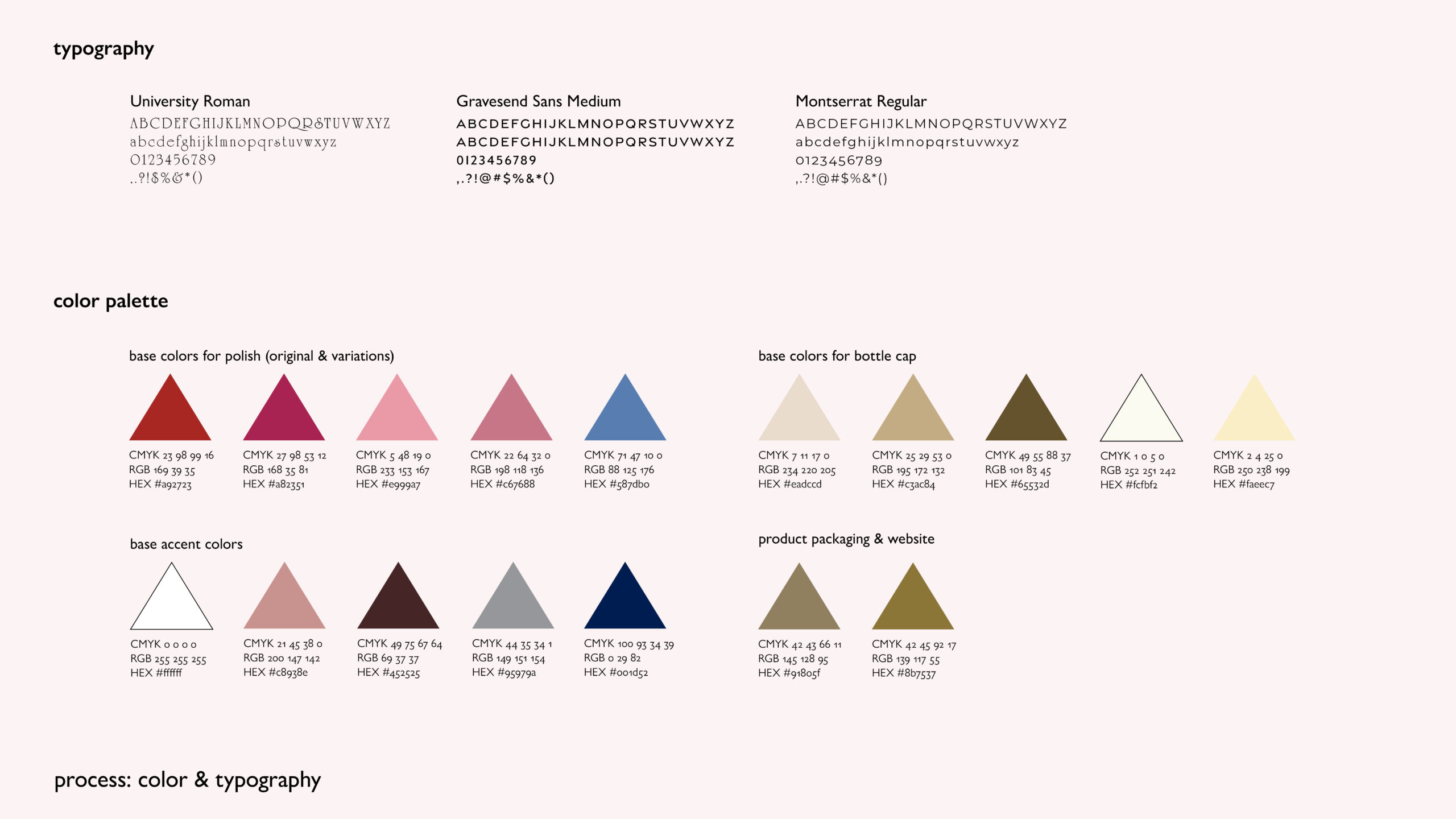
For this project, I used three typeface families: University Roman, Gravesend Sans, and Montserrat. I chose University Roman because the Jimmy Choo brand uses this typeface for their iconic wordmark. Gravesend Sans complemented University Roman and looked similar to other typefaces used in Jimmy Choo advertisements. I used an extensive color palette for this project (a selection of base colors are depicted below) and obtained many colors by sampling my original reference photo with the eye dropper tool in Adobe Illustrator.
